Think about your daily life, if you’re like most people you have your smartphone or tablet attached to the hip and probably use the internet more on your smartphone than on your desktop. As more and more people are becoming addicted to using their smartphones and tablets, the fact is; mobile is taking over the internet – from good old surfing to social media to even shopping.
What does this mean for your website? There’s no denying it, it’s crucial that your website is mobile friendly. Not so long ago to be on the cutting edge there would be a 1) desktop version and a 2) mobile version. And don’t get me started on sites that you have to zoom in to read text that’s 2 pixels tall on your phone.
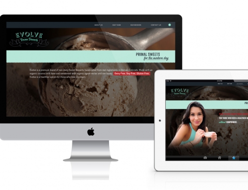
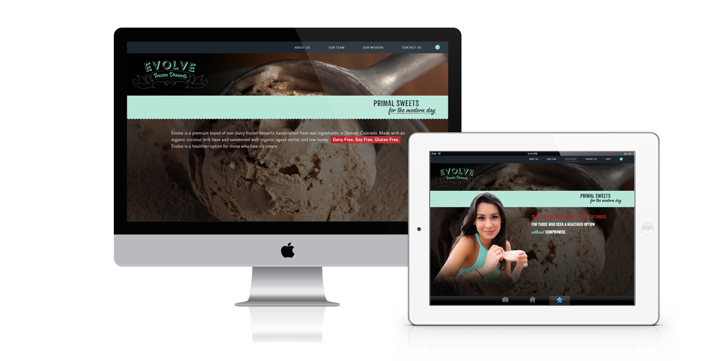
Now, it’s possible to have 1 site version that works optimally for both desktop and mobile users — responsive web design.
What is a Responsive Website?
Responsive design simply means your website has been built so that all of the content, images and navigation structure remains the same on any device. In other words, if someone sees the desktop version they are getting the full view. But when you view the same site on your smartphone or tablet it ‘responds’ and automatically reformats to be fully visible and ‘fit’ whatever screen you have, whether it’s an iPhone or a Galaxy Tablet.
In other words, with a responsive website design, you don’t have to have worry about having different websites for various devices or making sure that your site runs properly on a mobile device.
Mobile Use is Increasing.
Pretty much everyone is on their mobile device all the time. For some reason, however, there are many businesses who have not yet picked up on this trend. Maybe they could use the following stats from Smart Insights to convince them how much mobile usage has skyrocketed.
More than 20 percent of Google searches are now being performed on some sort of mobile device.
In 2012 over half of all local searches were done on a mobile device.
25 percent of Internet users only access the internet via a mobile device in the United States.
25.85 percent of all emails are opened on mobile phones, with another 10.16 percent being opened on tablets.
In 2014 mobile Internet usage is expected to overtake desktop usage.
Out of the 4 billion mobile phones in the world, 1.08 billion are smartphones and 3.05 are SMS enabled.
Recommended By Google
We all know that Google is a really big deal. In fact, the Big G claimed 67 percent search market share in 2013, making it the most popular search engine in the world. So, if Google claims that it prefers responsive web design as the recommended mobile configuration, that’s a pretty big hint — which was confirmed by Google’s Pierre Farr in June 2012.
But why does Google prefer responsive design? For starters, it’s more efficient for Google to bot crawl the site and then index and organize all the content that is online. The reason for this is that with responsive design, all sites have just one URL and the same HTML across all devices. When a business has both a mobile site and desktop site, there will be a different URL and different HTML for each. This forces Google to crawl and index multiple versions of the same exact site.
Also, when there is just one website and URL, it’s much easier for users to share, engage and interact with the content on that site as compared to a site that has different pages for mobile and desktop users. Google is a fan of that as well. Why? Because what if someone shared a mobile site on a social media outlet and one of their connections viewed that mobile site on their desktop? That viewer would then be viewing a less than optimal site because it was intended for mobile. This makes the user unhappy.
And Google realizes that unhappy people will go elsewhere, meaning that bounce rates increase and the site will not rank on mobile searches. This creates a whole big headache involving Google’s external link algorithm and on-page errors. Which in turn, also harms your SEO. In other words, it’s just bad for business for both Google and all of the websites that aren’t taking advantage of the benefits of responsive design.
Can Increase Conversion Rates
Besides all of the search benefits, as well as making users happy, responsive design has the ability to increase those coveted conversion rates from all of the mobile users in the world. Why? Well, if a website is not working on mobile or tablet device, users will obviously be unable to convert. And how many people are doing online shopping from a mobile device? There has been research that found 69% of tablet users shopped on their device within the last 30 days.
So, when a user has to do more work than needed to complete a conversion, do you think that they will still convert? It’s less likely they will convert. However, there’s a little more to it than that. For example, since a responsive website design can adjust to any screen, developers have control on how all of those conversion elements will display on mobile and tablet.
Finally, responsive design allows you to do some important high-end heatmapping and A/B testing, which can be done through software like Clicktale or Optimizely. This means that you can segment users by mobile and gain a better picture of how those users are interacting on your site. When you do this, you can discover what sales tactics and marketing strategies are effective, as well as, those that are not. When you have this information, you can increase conversion rates.
Social Media Has Gone Mobile
Even if you’re not engaged in inbound marketing, you probably realize how important blogging and social media are in the 21st Century. And social media has also now gone mobile, which you may have noticed. How important is mobile for social media users? According to a study from ComScore, 55% of social media consumption happens on a mobile device.
This is a really vital stat because what’s the point of sharing content on social media if it’s not compatible with mobile devices? Again, if a website isn’t functioning on a mobile device, users get frustrated and leave. High bounce rates = low conversion rates. And, that puts everyone in a bad mood.
Better User Experience
Responsive design gives users a better experience. For example, as mentioned before users don’t have to fool around with zooming and shrinking the text or images on screen. Instead, all of the content automatically adjusts to the screen of the device. This makes it easier and more convenient for users to read and navigate on your site.
And, there are stats to further illustrate why the experience of users is so important. According to Google’s Think Insights on Mobile, whenever someone arrives on your mobile website and is frustrated, or doesn’t see the content that they are searching for immediately, there’s a 61 percent chance they will leave and head to another website. However, whenever a user has had a positive experience with your mobile website, that individual will be 67 percent more likely to buy a product or use a service. Furthermore, 48 percent of users stated to Google that when a site doesn’t function on their mobile device it makes them feel that the company does not care for their business.
Easier to Manage
Going back to SEO for moment, if you have separate desktop and mobile sites, you’re going to have to run separate SEO campaigns for each. Wouldn’t it just be easier to manage only one SEO campaign and one website? That would make not just your customers happy, but also your team including everyone from developers to content marketing managers. More importantly because you only have one site, responsive design is more cost effective as well.
Stand Out and Stay Ahead
Stay ahead of the competition. If more and more users are using their mobile devices to search and make purchases online, you have to cater to that audience by having a mobile-friendly site. In fact, 85 percent of adults believe that a mobile site must be as good, if not better than, a desktop site.
Having a well designed, responsive website will not only help your company get ranked higher, it will generate a positive user experience and leave a great impression for your brand.
— Original article in Huffington Post Business by John Rampton.

Recent Comments